Friday, June 8, 2012

Week15: Presentation

The digital presentation is done with using "prezi"
The link is below.

http://prezi.com/s1e6bhsn1sr3/design-5-presentation/

A1 panel
Its a competition panel.
NOT a detailed panel.

Presenting with simple spacial sketches.

Floor plan

Renders

Site plan

Poem

Thursday, June 7, 2012

Week14:Design process

Revit final stage:

Taking about 10 hours to render this walk through.

The purpose of this is as if you are catching the ferry from city and pass the story bridge.

walk through renders
http://www.youtube.com/watch?v=_h7JhfitSzQ


Week13: Design process

Revit progression : light and texture

try to achieve the light and the texture in balance


Here we go with the renders from revit.

The reflections from the water gives texture which im trying to achieve here.

Week12: Design process

Revit in progress for updating my design

Some ongoing renders

 Bar
 Bar
 Bar
 Skyblue
Bar


Few changes have made with entrance of the bar. Now its accessible from the outside which it shows in the last render.


Skyblue seats are not formal for a reason.
1. Its a out door seats where people can choose their seating and positions
2. During the day, people can use that space to practice or to have a meeting.


Week11: Design process

So back in the drawing board.

I was concentrated more on auditorium and sky blue which i had the most negative feedback.

I have looked at the spacial quality on both sky blue and auditorium to compare and find the way to combine the space.


The bar needs a few changes. Since i had to avoid using the extensions, i need to minimize the space in the bar to make the circulation work.

Less changes is considered in Administrative design.

Week10: Feed back

The tutors gaved me a positive feed back with the use of light and texture.
My presentation panels were presented as below.

 Panel 1
 Panel 2
Panel 3


Now focusing on negative feed back.
The points are listed below that needs changes.
  •  No extension
  •  Roof over "blue sky" in audiences
  • Seats in "blue sky"
  • Show the views towards to the city, river and story bridge if i am talking about the essentials of the "views"
  • Try combining the space together (blue sky and auditorium)
General feedback
  • Bar in the ground floor
  • Think about the sound installations


Week9: Assessment 2 Presentation

The presentation is based on our progression for our design.
From the previous post, i have made a spacial quality for each buildings.
-Blue Sky
-Auditorium
-Administrative
-Bar

In the progression, i have made my model through revit.

Plan Auditorium


Plan Administrative


Plan Sky Blue


Plan Bar


As mentioned before, the texture and light is important for my design.


 I have used my influenced architecture building to implement into my building.

In result, i have included a wood strips along the building to bring the texture.

Render
Admin


Auditorium


Sky Blue


Bar


The render concentrates on the lighting quality and the usage of balanced texture and light.
What it creates is the warmth and cousy feeling. Its all bout the comfort of how people is going to use the space.

Week8: Design process

Week7: Site analysis

First to begin with, i have started with site analysis.


 This sketch shows the space quality and views from the river edge.

Concept of adding the extension outwards to the river (20m)


The building space allocation.


This idea of space are based on keeping the views to the city, river and the bridge. By extending the space outwards to river will maintain the views and keeps away from the existing building.Which also provides an additional ferry stop to make more access.

Week 6: Influence & idea

Looking through some examples in webs, i have come across with some influenced architecture concept.

 Busan Opera House: Concept


What i like about?
-Its got texture
-Organic
-Close to river
-Unique

What my design want it to be?
I want my design to be organic and flowed with the river as like this in example.
From the outside, i want the viewers to be seen as cousy and have a mood lights which attracts the people.
The balance of the light and materials are crucial to give the texture. Since my design is located in the river, the reflection of the use of light can be use to bring more attractions. (example 1 , 2)

Example 1

Example 2


Wednesday, April 11, 2012

Week5 : Blues Music

Our next task is to create an space for blues music

One outdoor auditorium =600 - 700 people
One indoor auditorium =200 people
One bar entertainment =250 people
Administration and academic studio

In discussion with tutors, our primary first step was to understand the system of sound and auditorium structure.
A structure study of DO or NOT TO DO in this certain criteria.

Unfortunately i could not find much resources in internet relating about auditorium structures and layout.

However i have found  a research relating to its administration and academic studio.
Its a place where people come to record their music and for tutoring.

Music studios: (Instrumental recording)
-Longer reverberation times
-Longer volume proportional
-Good sight and traffic lines
-Balance of absorption and diffusion
-Proper audio system

Vocal booths / studios
-Shorter Reverberation Times
-Smaller Volume proportional space
-Good sight and traffic lines
-Larger amounts of linear absorption with some diffusion
-Proper audio system

Audio control room / studio
-Shortest Reverberation Times
-Volumed spaced above 1500 cubic feet
-Careful use of bass tapping, absorption and diffusion
-Good sight and traffic lines
-Proper audio system
www.youtube.com/watch?v=l5ach88zssc

What is sound?
Sound is a type of energy made by vibrations. When any object vibrates, it causes movement in the air particles. These particles bump into the particles close to them, which makes them vibrate too causing them to bump into more air particles. This movement, called sound waves, keeps going until they run out of energy. If your ear is within range of the vibrations, you hear the sound. (http://www.sciencekidsathome.com/science_topics/what_is_sound.html)

How instruments make sounds?
In wind instruments, like the flute and trumpet, vibrating air makes the sound. (http://www.sciencekidsathome.com/science_topics/what_is_sound.html)

How fast is sounds?
Sound travels through air at 1,120 feet (340 meters) per second. (http://www.sciencekidsathome.com/science_topics/what_is_sound.html)


How to control sound reverberation?
·         -Correct room dimension
·         -Avoid parallell surfaces between the walls
·         -Between floor and ceiling
·         -Avoid sharp corners
·         -Absorbers panels
·         -Difusers can reflect sound in multiple direction
·         -Base traps absorbs low frequency sound waves


The difference between echo and reverberation.
 (http://www.physicsclassroom.com/mmedia/waves/er.cfm)

This animated diagram helps me to understand the difference between the indoor and outdoor sound travel.

Tuesday, March 27, 2012

Week4 : Presentation

Group meeting and work

When our group was heading to our fourth week to presentation.
We meet up to put all our drawings and sketches in panels.

We decided to seperate 3 A1 panels in context of,

Concept


Experience


Technical Drawings


I was more focused on the drawings based on "Technical drawings", using a software Revit to do Plan, Elevation, Section details. My other droup mate have done the explosion of the building.

In side, i have also done a simple experience diagram drawings on the Technical Drawing.
*The one with the 3D section with light quality experience.

We have finished our panels on Wednesday morning and ready to set for printing.
I have called the office work on monday to made a booking for wednesday to be organised.
To avoid late submission and it went extreamly well. With also, gives us a time set that we needed to finish before the bookings.

Overall we were happy with what we come up with. The panels looks great, and we gived it all.

In next Blog will post some others examples that might help us in future, and some avoidance aswell.

Sunday, March 18, 2012

Week3 : Design Concept

Design Concept

We come up with a concept with a war as we had our last meeting with a group.
We decided to come up with a individual conceptual design to show to ourselves and tutors to compare out design and pick.

I decided to design something that is "caved" where people to escape and feel safe.
Mostly using a natural grain stone material that is already exists in the site. (I am assuming sand stone. Since we cannot enter the site.)

The materials are used rusted steel and concrete.
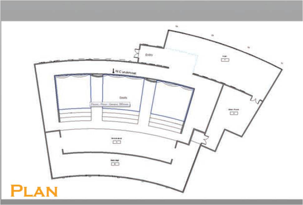
This photo represents plan and sections.

This is a design which is hidden half of the design within the cliff and the other is out.

The key notes
-Door is used rotating handling doors (As sometimes we can see in the ships)
-The natural stone walls have a water feature system
-Steel walls have a bullet holes that represents war times.
-Out door got a seats that look out the view.
-A wall that run through which gets narrow and in the end got a dash of natural light shining through.

Comment from tutors:
-They dont like the idea of building something within the cliff. (Didn't really mentioned specifically which is not really helpfull... its just a useless comments really without any specific reason)
-However they like the ideas of using the bullet holes as a texture.
-Not much comment about materials. Just nodded.
-Its really not the place that people will come back again.

In overall its a "start thinking again process"

As my other group mates got a same quotes from the tutors.

After
Our next day from the tutorial we had our meeting to discuss again with a design.

We taking the idea of "Allies" and "Axis".
Providing a CIRCULAR shape for each parties and combine them together.
This diagram represents the axis and allies are combined together which represents the war.

Which end up with the shape of the bottom drawings of this diagram.


This diagrams shows the concept of the design.

The lett top: Shows the center of the circle to be the idea of "Peace"

Right Top: Shows the Axis and Allies

Bottom right: Shows the example of circulations

Extra ideas: All the walls do have bullet holes. which adds the feeling of war.


This diagrams shows the contrast on different time of the day on how it feels like within inside.

Depends on the day, the situation of the battle will be change.

This will give the audience to keep them coming back to gain different experience.


This is during at night.

Shooting red lights outwards to attracts audience.

This also relates to the "flares" that they used during war times.

It gives texture and also visually appears during at night aswell.


This is our stage at the moment.
Tomorrow will have our meeting aswell to finalise our design and come up with a poster design.

Tuesday, March 13, 2012

Week2 : Site visits and group meetings.

Continuing from the last post.

The site
Our first step was to visit the site and we did.
However there was a no entry site where we have to take our photos from outside the boundary.

I have taken some photos viewing from Kangaroo Point and had a interesting idea of how the cliffs and topography works. The site is most likely covered with rocks and vegitations and also some existing buildings are there are not to be interfered.

             Left to Right pan view
This photos are originally taken by me using my phone.
As you can see in this photo there is a existing building on the left and the right centered from Story Bridge. The backgroud shows that its covered in vegitations.


 This photo is taken at the right side from the story bridge and it shows the much details of the cliffs.
This is the mostly the boundary of our site location. Its at the far right of the site and it shows a great texture of the cliffs. Its got a character and its beautiful. The positive is that there is no existing buildings surrounded.


Unfortunetly we cannot physically enter the site and its a shame that we cannot get our close up shots to see more in details.

Meeting

In our tutorial we had our discussion about our concept. One of my team mates brought up the theme of "View Gallery". A meaning of having our folie design to be focused on views or historical monumental to be at one place. The actual site is surrounded with a suburb of CBD, New Farm, Kangaroo Point and Fortitude Valley. We first discussed about locating the historical buildings within those suburbs that mentioned and make a sort of mapping view for our design concept.


This is a concept mapping diagram.
To considering of bringing all the historial monuments in one place.


By the end of our tutorial meeting last week, we decided to spread the work individually to find the historical buildings in surrounded suburbs.

This is the general information that i have researched.

Kangaroo point
-Story Bridge

CBD
-Treasury Casino
-Anzac Memorial
-Old Government House

New Fram
-Old Botanical Gardens
-Wilson"s Outlook

Fortitude Valley
-China Town
-Army Salvation

Our next individual meeting was on monday 12/03/2012.
We showed our progression and shared our ideas.
In general, our meeting was great in communication.
One of our team mates have come up with a new concept that we all agreed with.
 The reserached have showed that our site was used during in WW2 for Air shelters.
Which means a "place to escape and safety".
I have agreed to change our concept to this idea.

Why?
Its more focused and specific. Its got a historical value and its something that is forgotten.
I am assuming that the Story Bridge was build to remember those moments. But it does not represents the historical value within it.
Our concept was to build a folie that represents the "Life experience within those times".

Therefore we brainstorm of what would be like to live those times...

Therefore these are the words that concentrating when designing our concept.

To make it more interesting we are going to design something that interacts with our sences.

Touch / Do
-Rotating lock door. 

Hear
-Water dropping
-Metal or steel hitting

Vision
-Bullet holes
-Rotten iron
 
Smell
-Antique essence
-Metal smell
 
So there it is for now. We are going to meet up tomorrow for our tutorial and discuss with our design.
Then from there on, we are going to split the work load to prepare for our presentation next week.

Wednesday, February 29, 2012

Week1 : Introduction

As our assignments, we need to form a group of 3~4 to design a folie.

It must be "Activators of space"
     *A meaning of people will use the space for their own.
           -For study
           -Learning space
           -Least for 2 people
           -Small design (5m x 5m x 5m)

So whats the step??

1. Site
We need as a group to visit the site to understand the situation. Such as: Resources, Transport, Environment, Contours, Space, Views, Existing and Demolished buildings.

2. Concept - 300 words in posters
As we going progress, we need to come up with the concept of the theme.
Question ourselves.
    -What is our purpose?
    -Conventional? or Comfort?
    -Blend in with the surrounding environment?
    -Or to design something diverse to the surrounding to make it stand out?
    -Where did our design got influenced by?


3. Context
We need to think about the environment deeper in surroundings.
-Did we achieved the design linking to our concept?
Review the draft of the design and go through the question that is mentioned in "Concept".

4. Function
Now the design is on progress, our next thing to do is the functions. As in transportation, circulation and entry.
We need to think about how people will enter through experience and easy accessibility.
Is it suitable for disable people? Is it easy to access? Is it legal and stable?

5. Tectonic
The structure are now the key of how to build the design. Not just the structure, but the interior walls and exterior walls. The materials are needs to be analyse what to use to meet its requirements.

6. Experience
Experience are the way how people would feel when they inside, enter or to access the folie.
Is it dimmed? comfort? open? natural?
With these the materials are needed to be decided carefully to meet its tectonic.

So?
As I have already formed a group, our first task is to visit the site and its scheduled this upcoming friday (01/03/2012).
-Taking photos and videos.
-Mapping the important location, accessibility and public transport.
-Get a contour map of the site.
-To progress our Masterplan.