Friday, June 8, 2012

Week15: Presentation

The digital presentation is done with using "prezi"
The link is below.

http://prezi.com/s1e6bhsn1sr3/design-5-presentation/

A1 panel
Its a competition panel.
NOT a detailed panel.

Presenting with simple spacial sketches.

Floor plan

Renders

Site plan

Poem

Thursday, June 7, 2012

Week14:Design process

Revit final stage:

Taking about 10 hours to render this walk through.

The purpose of this is as if you are catching the ferry from city and pass the story bridge.

walk through renders
http://www.youtube.com/watch?v=_h7JhfitSzQ


Week13: Design process

Revit progression : light and texture

try to achieve the light and the texture in balance


Here we go with the renders from revit.

The reflections from the water gives texture which im trying to achieve here.

Week12: Design process

Revit in progress for updating my design

Some ongoing renders

 Bar
 Bar
 Bar
 Skyblue
Bar


Few changes have made with entrance of the bar. Now its accessible from the outside which it shows in the last render.


Skyblue seats are not formal for a reason.
1. Its a out door seats where people can choose their seating and positions
2. During the day, people can use that space to practice or to have a meeting.


Week11: Design process

So back in the drawing board.

I was concentrated more on auditorium and sky blue which i had the most negative feedback.

I have looked at the spacial quality on both sky blue and auditorium to compare and find the way to combine the space.


The bar needs a few changes. Since i had to avoid using the extensions, i need to minimize the space in the bar to make the circulation work.

Less changes is considered in Administrative design.

Week10: Feed back

The tutors gaved me a positive feed back with the use of light and texture.
My presentation panels were presented as below.

 Panel 1
 Panel 2
Panel 3


Now focusing on negative feed back.
The points are listed below that needs changes.
  •  No extension
  •  Roof over "blue sky" in audiences
  • Seats in "blue sky"
  • Show the views towards to the city, river and story bridge if i am talking about the essentials of the "views"
  • Try combining the space together (blue sky and auditorium)
General feedback
  • Bar in the ground floor
  • Think about the sound installations


Week9: Assessment 2 Presentation

The presentation is based on our progression for our design.
From the previous post, i have made a spacial quality for each buildings.
-Blue Sky
-Auditorium
-Administrative
-Bar

In the progression, i have made my model through revit.
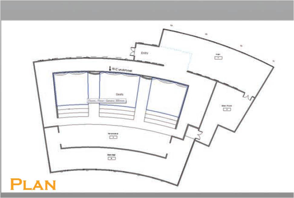
Plan Auditorium


Plan Administrative


Plan Sky Blue


Plan Bar


As mentioned before, the texture and light is important for my design.


 I have used my influenced architecture building to implement into my building.

In result, i have included a wood strips along the building to bring the texture.

Render
Admin


Auditorium


Sky Blue


Bar


The render concentrates on the lighting quality and the usage of balanced texture and light.
What it creates is the warmth and cousy feeling. Its all bout the comfort of how people is going to use the space.

Week8: Design process

Week7: Site analysis

First to begin with, i have started with site analysis.


 This sketch shows the space quality and views from the river edge.

Concept of adding the extension outwards to the river (20m)


The building space allocation.


This idea of space are based on keeping the views to the city, river and the bridge. By extending the space outwards to river will maintain the views and keeps away from the existing building.Which also provides an additional ferry stop to make more access.

Week 6: Influence & idea

Looking through some examples in webs, i have come across with some influenced architecture concept.

 Busan Opera House: Concept


What i like about?
-Its got texture
-Organic
-Close to river
-Unique

What my design want it to be?
I want my design to be organic and flowed with the river as like this in example.
From the outside, i want the viewers to be seen as cousy and have a mood lights which attracts the people.
The balance of the light and materials are crucial to give the texture. Since my design is located in the river, the reflection of the use of light can be use to bring more attractions. (example 1 , 2)

Example 1

Example 2